optuna.visualization.matplotlib.plot_optimization_history
- optuna.visualization.matplotlib.plot_optimization_history(study, *, target=None, target_name='Objective Value', error_bar=False)[source]
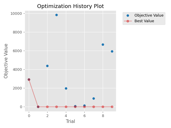
Plot optimization history of all trials in a study with Matplotlib.
See also
Please refer to
optuna.visualization.plot_optimization_history()for an example.Example
The following code snippet shows how to plot optimization history.
import optuna
import matplotlib.pyplot as plt


def objective(trial):
    x = trial.suggest_float("x", -100, 100)
    y = trial.suggest_categorical("y", [-1, 0, 1])
    return x ** 2 + y

sampler = optuna.samplers.TPESampler(seed=10)
study = optuna.create_study(sampler=sampler)
study.optimize(objective, n_trials=10)

optuna.visualization.matplotlib.plot_optimization_history(study)
plt.tight_layout()
Note
You need to adjust the size of the plot by yourself using
plt.tight_layout()orplt.savefig(IMAGE_NAME, bbox_inches='tight').- Parameters
study (Union[Study, Sequence[Study]]) – A
Studyobject whose trials are plotted for their target values. You can pass multiple studies if you want to compare those optimization histories.target (Optional[Callable[[FrozenTrial], float]]) –
A function to specify the value to display. If it is
Noneandstudyis being used for single-objective optimization, the objective values are plotted.Note
Specify this argument if
studyis being used for multi-objective optimization.target_name (str) – Target’s name to display on the axis label and the legend.
error_bar (bool) – A flag to show the error bar.
- Returns
A
matplotlib.axes.Axesobject.- Return type
Axes
Note
Added in v2.2.0 as an experimental feature. The interface may change in newer versions without prior notice. See https://github.com/optuna/optuna/releases/tag/v2.2.0.